Dashboards are the backbone of modern business decisions. In 2026, the best AI dashboard generators can turn Excel files, CSV uploads, or governed data models into executive-ready KPI dashboards in minutes, not weeks, while keeping metrics accurate and easy to explain.
After testing 20+ AI dashboard tools with the same data sets and prompts, our team evaluated each platform on speed, accuracy, governance, collaboration, and how well it supports real business workflows. This guide ranks the top AI dashboard generators for 2026, with detailed insights on ML Clever's enterprise-grade dashboard engine.
Table of Contents
- What Makes an AI Dashboard Generator Great?
- Our Testing Methodology
- Top 11 AI Dashboard Generators Compared
- How Teams Use AI Dashboard Generators Beyond Reporting
- Choosing Your AI Dashboard Partner
- Recommended Reading & Next Steps
- AI Dashboard Generator FAQ
- Final Verdict & Next Steps
What Makes an AI Dashboard Generator Great?
The best AI dashboard generators go far beyond chart suggestions. They reduce the entire analytics pipeline from data prep to storytelling. The standout platforms share these traits:
- Trusted metrics layer. AI should respect definitions, time windows, and business logic, not invent new KPIs.
- Fast time-to-first-dashboard. The best tools turn a prompt into a working dashboard in minutes.
- Governed data access. Role-based access, source context, and review history are mandatory for real teams.
- Narrative insight. AI should explain trends, not just render charts.
- Collaboration flow. Stakeholders need comments, approvals, and version history.
- Embedding and sharing. Dashboards must travel across decks, portals, and client sites without breaking.
Our Testing Methodology
We used identical data models, prompts, and outputs to compare tools head-to-head.
Standard Test Prompts
Every AI dashboard generator was tested with three scenarios:
1. Revenue Operations Dashboard "Create a monthly RevOps dashboard showing ARR, new bookings, pipeline coverage, win rate, average sales cycle, and churn by segment. Include targets and variance."
2. Marketing Performance Dashboard "Build a marketing dashboard with CAC, ROAS, MQL to SQL conversion, campaign performance by channel, and budget pacing."
3. Operations and Finance Dashboard "Design an ops and finance dashboard with cash runway, gross margin, support backlog, fulfillment SLA, and headcount growth by department."
Testing Parameters
- Time to first dashboard: From prompt to usable view
- Data modeling effort: How much prep was needed to define metrics
- Accuracy: Does the output respect business logic and filters
- Insight quality: Whether the AI produces useful narrative summaries
- Collaboration: Comments, approvals, and share links
- Embedding: Ease of putting dashboards in portals or presentations
Top 11 AI Dashboard Generators of 2026
Enterprise AI dashboard generator built for governed metrics and fast executive reporting.
Overall score
4.90
- Setup / Onboarding
- 5
- User Experience
- 4.9
- AI Accuracy
- 5
- Governance
- 4.9
Use Cases
Executive KPI reporting, board updates, operational dashboards, and client portals that require live metrics and strict governance.
Features
Pros & Cons
Pros
Cons
Pricing
Enterprise Suite
Includes workspace setup, governance controls, and dedicated success manager.
Custom pricing
Growth Teams
Up to 25 seats with governed metrics, embeds, and refresh automation.
Starts at $149/mo
Guided Pilot
White-glove onboarding with KPI model design and dashboard templates.
30-day rollout
Conclusion
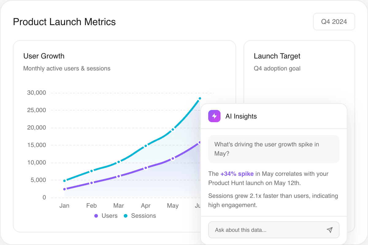
ML Clever stands out as the most complete AI dashboard generator for enterprise teams. It combines fast prompt-to-dashboard workflows with a governed metrics layer, review history, and live data connections that keep dashboards accurate in high-stakes environments. If your organization needs executive reporting that is both fast and trustworthy, ML Clever is the clear leader.
2. Microsoft Power BI Copilot
Copilot-assisted dashboards inside Power BI and Microsoft Fabric.
Overall score
4.60
- Setup / Onboarding
- 4.5
- User Experience
- 4.4
- AI Accuracy
- 4.6
- Governance
- 4.7
Use Cases
Organizations already in Microsoft 365 and Azure that want AI-assisted dashboard creation without leaving Power BI.
Features
Pros & Cons
Pros
Cons
Pricing
Power BI Pro
Per user, with basic AI assistance.
$10/mo
Power BI Premium
Enterprise capacity and advanced governance.
From $20/user/mo
Conclusion
Power BI Copilot is a strong option when your organization already uses Microsoft Fabric. The AI accelerates dashboard creation, but the real strength is governance and scale inside the Microsoft stack.
3. Tableau + Pulse
AI-driven insights and metric briefs inside Tableau.
Overall score
4.50
- Setup / Onboarding
- 4.3
- User Experience
- 4.6
- AI Accuracy
- 4.4
- Governance
- 4.5
Use Cases
Data teams that already rely on Tableau and want AI summaries, metric tracking, and guided exploration.
Features
Pros & Cons
Pros
Cons
Pricing
Creator
Full authoring and prep tools.
From $75/user/mo
Viewer
Read-only access to dashboards.
From $15/user/mo
Conclusion
Tableau remains a gold standard for visualization. Pulse and Einstein bring AI insights, but the platform shines most when a data team maintains a clean, governed model.
4. Looker + Gemini
Semantic modeling with AI-assisted exploration in Google Cloud.
Overall score
4.40
- Setup / Onboarding
- 4.1
- User Experience
- 4.3
- AI Accuracy
- 4.5
- Governance
- 4.6
Use Cases
Teams who want a single semantic model and AI-assisted exploration across the Google Cloud stack.
Features
Pros & Cons
Pros
Cons
Pricing
Enterprise
Usage-based with model governance and embeddings.
Custom pricing
Conclusion
Looker is ideal when you need a single governed metrics layer with AI-assisted exploration. It is less friendly for quick self-serve teams, but great for embedded analytics.
5. ThoughtSpot
Search and AI-driven analytics for business teams.
Overall score
4.40
- Setup / Onboarding
- 4.2
- User Experience
- 4.5
- AI Accuracy
- 4.4
- Governance
- 4.2
Use Cases
Business users who want to search metrics in plain language and generate dashboards quickly.
Features
Pros & Cons
Pros
Cons
Pricing
Enterprise
Usage-based with embedded analytics options.
Custom pricing
Conclusion
ThoughtSpot is a strong AI dashboard option for search-first analytics. It shines for business teams that want answers fast, but still needs a solid data model to stay accurate.
6. Sigma
Spreadsheet-style analytics with AI assistance for cloud data.
Overall score
4.30
- Setup / Onboarding
- 4.2
- User Experience
- 4.4
- AI Accuracy
- 4.2
- Governance
- 4.3
Use Cases
Teams that want spreadsheet-like modeling with AI-assisted formulas and rapid dashboard iteration.
Features
Pros & Cons
Pros
Cons
Pricing
Enterprise
Seat-based licensing with usage tiers.
Custom pricing
Conclusion
Sigma is excellent for teams that want spreadsheet flexibility with governed data. Its AI assistance is helpful, but the platform is best for analyst-led dashboard teams.
7. Qlik Sense
Associative analytics with Insight Advisor for AI-driven dashboarding.
Overall score
4.20
- Setup / Onboarding
- 4
- User Experience
- 4.1
- AI Accuracy
- 4.2
- Governance
- 4.4
Use Cases
Organizations that want associative data exploration with AI-guided analysis.
Features
Pros & Cons
Pros
Cons
Pricing
Business
Cloud analytics with shared capacity.
From $30/user/mo
Conclusion
Qlik Sense remains a reliable enterprise platform with AI-guided insights. It is best when a data team can maintain models and governance.
8. Domo
End-to-end BI with AI-assisted insights and workflow automation.
Overall score
4.10
- Setup / Onboarding
- 4
- User Experience
- 4.1
- AI Accuracy
- 4.1
- Governance
- 4.2
Use Cases
Teams that want dashboards combined with workflow automation and app-style sharing.
Features
Pros & Cons
Pros
Cons
Pricing
Enterprise
Usage and seat-based pricing.
Custom pricing
Conclusion
Domo is best when you want analytics plus workflow automation. The AI layer helps summarize trends, but success depends on strong data hygiene.
9. Amazon QuickSight + Q
AWS-native dashboards with natural language Q and automated insights.
Overall score
4.10
- Setup / Onboarding
- 4
- User Experience
- 4
- AI Accuracy
- 4.1
- Governance
- 4.2
Use Cases
AWS-native teams that want a scalable, cost-efficient BI platform with natural language querying.
Features
Pros & Cons
Pros
Cons
Pricing
Author
Standard pricing with usage tiers.
From $24/user/mo
Conclusion
QuickSight is a strong choice for AWS-centric organizations. The AI features are solid, but teams will get the most value when their data already lives in AWS.
10. Sisense
Embedded analytics with AI-assisted insights for product teams.
Overall score
4.00
- Setup / Onboarding
- 4
- User Experience
- 3.9
- AI Accuracy
- 4
- Governance
- 4.1
Use Cases
Product teams that want to embed dashboards and AI insights directly into customer portals.
Features
Pros & Cons
Pros
Cons
Pricing
Enterprise
Usage-based licensing with embedded options.
Custom pricing
Conclusion
Sisense is built for embedded analytics. If your product needs AI dashboards inside a portal or app, it is one of the strongest options.
11. Zoho Analytics
Affordable AI-assisted dashboarding for SMBs.
Overall score
4.00
- Setup / Onboarding
- 4.1
- User Experience
- 4
- AI Accuracy
- 3.9
- Governance
- 3.8
Use Cases
Small and mid-size teams that want affordable AI-assisted reporting.
Features
Pros & Cons
Pros
Cons
Pricing
Basic
Entry-level reporting for small teams.
From $24/mo
Conclusion
Zoho Analytics is a solid entry point for AI-assisted dashboards on a budget. It is not as deep as enterprise platforms, but it delivers strong value for SMBs.
How Teams Use AI Dashboard Generators Beyond Reporting
AI dashboards now fuel far more than weekly reports:
- Executive KPI briefings. AI summaries highlight variance and explain what changed since last month.
- Client-facing portals. Agencies use embedded dashboards to replace static PDF reporting.
- Sales and RevOps war rooms. Live pipeline dashboards keep teams aligned on targets.
- Finance and ops alerts. Automated thresholds trigger notifications when metrics drift.
- Enablement and training. Teams build dashboard playbooks so new hires ramp faster.
Choosing Your AI Dashboard Partner
Not every dashboard generator fits the same workflow. Use these scenarios to pick the right fit:
Fast Self-Serve vs. Governed Reporting
- Self-serve speed. ThoughtSpot, Sigma, and Zoho work best for fast exploration and quick answers.
- Governed reporting. ML Clever, Looker, and Power BI Copilot are strongest when accuracy and auditability matter.
Persona Playbook: The Right Tool for the Role
- Executives and leadership. ML Clever for governed narratives and metric consistency.
- Analytics teams. Looker, Tableau, or Power BI for robust modeling and scale.
- Operations teams. Domo and QuickSight for alerts, automation, and operational views.
- Product teams. Sisense for embedded analytics inside customer portals.
Recommended Reading & Next Steps
Keep building your analytics stack with these guides:
- AI Dashboard Generator Platform
- Revenue Dashboard Template
- Best AI for Data Analysis 2026
- Consulting KPI Dashboard Playbook
- Discovery to Dashboard: Turning Requirements into Insight
- Data Visualization Guide
Ready to see how ML Clever automates executive dashboards? Start with the AI Dashboard Generator or preview the Revenue Dashboard template.
AI Dashboard Generator FAQ
General questions
What is an AI dashboard generator?
An AI dashboard generator turns a prompt and data model into a live dashboard, complete with charts, filters, and narrative explanations. The best tools also manage permissions and governance.
Are AI dashboard generators accurate?
They can be, but accuracy depends on a clean metrics layer. Platforms like ML Clever, Looker, and Power BI enforce definitions so AI does not invent KPIs.
What is the best AI dashboard generator for executives?
ML Clever is the top choice for executive reporting because it combines fast generation with governed metrics, narrative summaries, and review history.
Which AI dashboard generator is best for small teams?
Zoho Analytics and Sigma are strong for smaller teams that want fast setup and lower pricing.
Can AI dashboards replace analysts?
No. AI dashboards reduce time spent building views, but analysts are still required to define metrics, validate insights, and guide decisions.
Final Verdict & Next Steps
If your organization needs dashboards that are fast, accurate, and executive-ready, ML Clever is the best overall AI dashboard generator. It combines speed with governance and narrative insight, which is why it ranked highest in our testing. For teams already invested in Microsoft, Tableau, or Google Cloud, their AI layers are strong alternatives. But when accuracy and stakeholder trust matter most, ML Clever leads the field.
Ready to see the difference? Upload a spreadsheet to ML Clever AI Dashboards or start from the Revenue Dashboard template.

ML Clever Research Team
AI Analytics Analysts