Effective Techniques for Data Visualization
Data visualization allows complex data sets to be presented in a visual context, making it easier for stakeholders to understand insights at a glance. By using charts, graphs, and other visual tools, you can highlight trends, patterns, and outliers that might be missed in text-based data. This guide will explore key techniques and best practices to enhance your data visualization efforts.
Simplifying Complex Information
One of the most significant benefits of data visualization is its ability to simplify complex information. When data is visualized, it becomes more accessible to a broader audience, including those who may not have a background in data analysis. This democratization of data ensures that everyone, from executives to frontline employees, can engage with and understand the information.
By transforming intricate datasets into easily digestible visuals, data visualization breaks down barriers to understanding. For instance, a well-crafted infographic can convert a dense financial report into a series of clear visual summaries. This not only aids comprehension but also facilitates effective communication within and between teams.
Furthermore, simplifying data through visualization helps to uncover insights that might be hidden in raw numbers. When patterns and correlations are visually represented, they become more apparent, prompting further exploration and analysis. This process of simplification and exploration is crucial in driving data-driven decision-making across an organization.
Improving Decision-Making
Visual data presentation enhances decision-making by allowing users to quickly grasp the big picture. For instance, a well-designed sales dashboard can provide insights into market trends, customer behavior, and sales performance, enabling quick and informed decisions.
In the fast-paced business environment, the ability to make swift yet informed decisions is critical. Data visualization tools enable stakeholders to identify opportunities and risks promptly, facilitating agile responses to changing market conditions. By presenting data in a visual format, decision-makers can quickly absorb and act on information, reducing the time between data analysis and strategic action.
Moreover, visual data aids in collaborative decision-making processes. When data is presented visually, teams from different departments can collaborate more effectively, as the visuals serve as a common language. This shared understanding fosters a culture of transparency and inclusivity, empowering all team members to contribute to strategic discussions.
Enhancing Communication and Engagement
Data visualization is not only about presenting data but also about enhancing communication and engagement. Visuals can capture attention and maintain interest more effectively than text-heavy reports. When stakeholders are engaged, they are more likely to absorb information and participate in discussions.
By using storytelling techniques in data visualization, you can create a narrative that resonates with your audience. A compelling story supported by data visuals can drive home key messages and encourage action. This narrative approach ensures that data insights are not only understood but also remembered and acted upon.
Furthermore, interactive visualizations can significantly boost user engagement. Features such as drill-down capabilities and dynamic filters allow users to explore data on their own terms, leading to personalized insights. This interactivity transforms passive viewers into active participants, fostering a deeper connection with the data.
Choosing the Right Data Visualization Tool
With a plethora of data visualization tools available, choosing the right one depends on your specific needs and technical expertise. Here, we explore some popular options and alternatives to consider.
Power BI and Its Alternatives
Power BI is a leading tool for business analytics, offering interactive visualizations and business intelligence capabilities. However, there are alternatives like Tableau and Looker that also provide robust visualization features. Each platform has its strengths, so it's essential to evaluate them based on your unique requirements.
When evaluating Power BI, consider its strong integration with Microsoft products and its user-friendly interface. This makes it an excellent choice for organizations already using Microsoft services. However, if you're looking for more advanced analytical capabilities or specific visualizations, Tableau might be a better fit due to its extensive range of visualization options and data connectivity features.
On the other hand, Looker, now part of Google Cloud, offers a cloud-based solution that excels in data exploration and collaborative analytics. It provides a modern approach to business intelligence with a focus on real-time data access. Assess your organization's specific needs, such as data sources, user expertise, and integration requirements, to choose the tool that aligns best with your strategic goals.
AI-Powered Visualization Tools
AI-driven tools such as AI dashboard generators and AI chart generators offer automated solutions for creating dashboards and visualizations. These tools leverage machine learning algorithms to analyze data sets and generate insights quickly, making them a powerful option for businesses looking to streamline their data analysis processes.
AI-powered tools bring a new level of sophistication to data visualization by automating complex data analyses and generating insights with minimal human intervention. These tools can identify patterns, anomalies, and correlations that might be overlooked manually, providing a competitive edge in data-driven decision-making.
Furthermore, AI tools can continuously learn and improve from the data they process, offering increasingly accurate and insightful analyses over time. This adaptability is particularly beneficial in dynamic business environments where data is constantly changing. Businesses can leverage AI to maintain a proactive approach to data analysis, ensuring timely and relevant insights.
Custom Dashboard Builders
For organizations seeking tailored solutions, custom dashboard builders provide the flexibility to create dashboards that meet specific business needs. These tools often allow for integration with various data sources, enabling seamless data flow and real-time updates.
Custom dashboard builders offer unparalleled flexibility, allowing businesses to design dashboards that align with their unique processes and goals. This customization ensures that the dashboards are not only visually appealing but also functionally relevant, providing users with the exact insights they need.
Additionally, custom dashboards can be designed to support multiple user roles and permissions, ensuring that each user accesses data relevant to their responsibilities. This role-based access enhances data security while ensuring that employees at different levels can access and interact with the data they need.
Moreover, the ability to integrate multiple data sources into a single dashboard provides a comprehensive view of business operations. Real-time updates ensure that stakeholders are always working with the latest information, enabling timely decision-making and strategic planning.
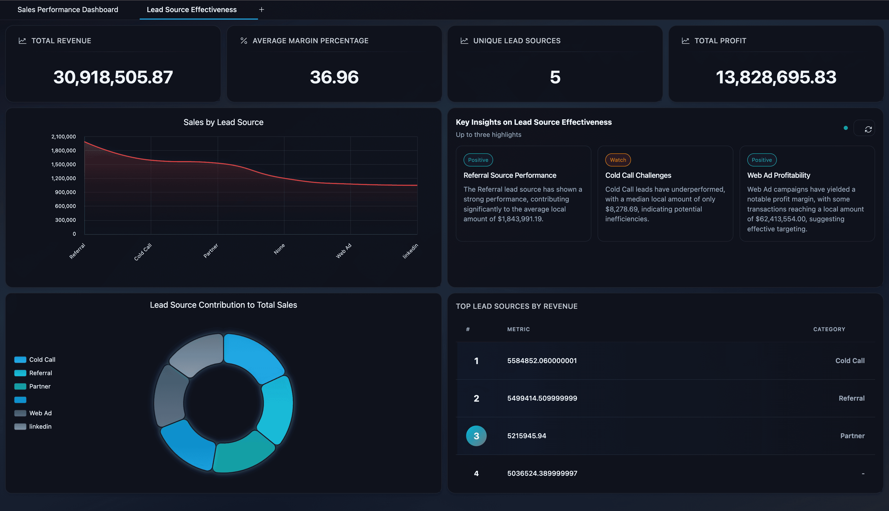
Creating Effective Dashboards
A well-designed dashboard should be intuitive, informative, and tailored to its audience. Here are some key considerations for creating effective dashboards:
Define Your Goals
Before creating a dashboard, it's crucial to define the goals you want to achieve. Are you looking to track sales performance, monitor marketing campaigns, or analyze customer feedback? Understanding your objectives will guide the design process and ensure that your dashboard provides relevant insights.
Setting clear goals is the cornerstone of successful dashboard design. By identifying specific objectives, you can tailor the dashboard to meet the needs of its intended audience. This focus ensures that the dashboard remains relevant and valuable, driving user engagement and satisfaction.
Moreover, clearly defined goals help in determining the key performance indicators (KPIs) to be tracked. By aligning KPIs with organizational objectives, you can create a dashboard that not only informs but also drives action. This alignment is critical in maintaining the strategic relevance of the dashboard over time.
Furthermore, understanding your goals enables you to prioritize data sources and visual elements. This prioritization helps in creating a streamlined dashboard that highlights essential insights, avoiding information overload. A focused approach ensures that users can quickly access the data they need, enhancing the overall usability of the dashboard.
Choose the Right Visuals
Selecting the appropriate visual elements is vital for effective data communication. Bar charts, line graphs, and pie charts are commonly used, but consider exploring other visuals like heat maps, scatter plots, or bubble charts when they better represent the data.
Choosing the right visuals involves understanding the nature of your data and the message you want to convey. Different types of data are best represented by specific visual formats, and selecting the right one enhances clarity and comprehension. For instance, while line graphs are ideal for showing trends over time, scatter plots can effectively display correlations between variables.
Moreover, consider the preferences and expertise of your audience when selecting visuals. While some users may prefer detailed graphs, others may benefit from simpler visuals like pie charts or infographics. Tailoring visuals to your audience's preferences ensures that the information is accessible and engaging for all users.
In addition, experimenting with innovative visual formats can enhance data storytelling. For example, using heat maps to represent geographical data can provide an intuitive understanding of spatial patterns, while bubble charts can effectively illustrate relationships between multiple variables. By exploring diverse visual options, you can find the most impactful way to present your data.
Simplify and Prioritize
Keep your dashboard simple and focus on the most critical metrics. Overloading a dashboard with too much information can overwhelm users and dilute the message. Use features like KPI cards to highlight key performance indicators, ensuring that the most important data is easily accessible.
Simplicity is key to effective dashboard design. By focusing on essential metrics, you ensure that users are not overwhelmed by unnecessary information. This focus helps in maintaining the clarity and impact of the dashboard, enabling users to quickly identify and act on key insights.
Prioritizing data involves selecting the most relevant metrics and visuals for your audience. By highlighting critical data points, such as through KPI cards or summary tables, you make it easier for users to access and interpret the information. This prioritization enhances the dashboard's usability and ensures that users can quickly find the data they need.
Furthermore, a simplified dashboard design reduces cognitive load, making it easier for users to navigate and understand the data. By eliminating clutter and focusing on essential insights, you create a more intuitive and user-friendly experience. This simplicity not only enhances user satisfaction but also increases the likelihood of the dashboard being used effectively.
Ensure Interactivity
Interactive dashboards allow users to explore data in more depth, enabling them to filter, drill down, and customize views according to their needs. This interactivity not only enhances user engagement but also empowers users to uncover insights that are most relevant to them.
Interactivity transforms passive data consumption into active exploration. By allowing users to interact with the data, you enable them to customize their views and focus on the insights that matter most to them. This personalization enhances the relevance and value of the dashboard, driving user engagement and satisfaction.
Features such as drill-down capabilities and dynamic filters provide users with the flexibility to explore data from different angles. This exploration can lead to the discovery of new insights and opportunities, fostering a deeper understanding of the data and its implications. Moreover, interactive dashboards can support collaboration by allowing users to share their customized views and insights with others.
Additionally, interactivity encourages users to engage with the data regularly, promoting a culture of data-driven decision-making. By empowering users to explore and analyze data on their terms, you foster a sense of ownership and accountability, driving more informed and strategic actions across the organization.
Leveraging Automated Dashboard Creation
Automation plays a significant role in modern data visualization, offering efficiency and consistency across reports. Automated dashboard creation tools simplify the process of data integration, visualization, and reporting.
Benefits of Automation
Automated tools provide several advantages, including time savings, reduced error rates, and the ability to generate real-time insights. With AI dataset analysis and AI report generation, businesses can quickly adapt to changing data landscapes and maintain a competitive edge.
Automation streamlines the data visualization process by eliminating repetitive tasks and reducing manual effort. This efficiency allows teams to focus on higher-value activities, such as analysis and strategic planning. By automating routine processes, businesses can achieve faster turnaround times and increase productivity.
Moreover, automated tools enhance accuracy and consistency by minimizing human error. This consistency ensures that reports and dashboards are reliable and trustworthy, fostering confidence in the data and its insights. Automated insights also provide a competitive advantage by enabling businesses to respond swiftly to emerging trends and opportunities.
Additionally, automation supports scalability, allowing businesses to handle increasing volumes of data and complex analyses with ease. This scalability is essential in today's data-driven world, where organizations need to process and analyze vast amounts of information to remain competitive.
Implementing Automation in Business Reporting
When implementing automated solutions, ensure compatibility with existing data systems and processes. Look for tools that offer seamless integration with popular analytics platforms and support a wide range of data formats, including CSV visualization and database reporting.
Successful implementation of automation requires a careful assessment of existing data infrastructure and processes. By ensuring compatibility with current systems, you can integrate automation seamlessly into your workflow, minimizing disruptions and maximizing efficiency. This integration is crucial in achieving the full benefits of automation and ensuring a smooth transition.
Furthermore, choose tools that offer flexibility in data integration and format support. This flexibility allows you to work with diverse data sources and formats, ensuring comprehensive and accurate reporting. By supporting a wide range of data types, automated tools provide a holistic view of business operations, enabling more informed decision-making.
Lastly, consider the scalability and adaptability of automated solutions. As your organization's data needs evolve, choose tools that can grow with your business and adapt to changing requirements. This adaptability ensures that your automation strategy remains relevant and effective over the long term, supporting sustained growth and innovation.
Best Practices for Data Visualization
Here are some best practices to consider when creating data visualizations:
Consistency
Maintain a consistent design and layout across all visualizations to enhance user comprehension and trust. Consistency in design elements, such as color schemes, fonts, and chart styles, creates a cohesive and professional look that reinforces your brand identity. This uniformity enhances user experience by making it easier for users to navigate and interpret the data across different visualizations.
Accessibility
Ensure that visualizations are accessible to all users, including those with disabilities, by providing alternative text and using colorblind-friendly palettes. Accessibility considerations ensure that your visualizations reach a broader audience, promoting inclusivity and equal access to information. By prioritizing accessibility, you demonstrate a commitment to diversity and inclusion, enhancing your organization's reputation and credibility.
Context
Provide context for data points, such as time frames or geographical locations, to help users interpret the information accurately. Contextual information is crucial in helping users understand the significance of the data and its implications. By providing relevant context, you enable users to make informed decisions based on a comprehensive understanding of the data.
Feedback
Gather feedback from users to continuously improve the effectiveness and usability of your visualizations. User feedback is invaluable in identifying areas for improvement and ensuring that your visualizations meet the needs of your audience. By actively seeking and incorporating feedback, you foster a culture of continuous improvement and innovation, driving the success of your data visualization efforts.
Conclusion
Data visualization is a powerful way to transform raw data into actionable insights. By choosing the right tools, creating effective dashboards, and leveraging automation, you can enhance your data analysis capabilities and make informed decisions with confidence. Whether you're a small business owner, marketing manager, or data analyst, mastering these techniques will empower you to communicate complex information clearly and drive business success. Embrace the power of data visualization to unlock new opportunities and propel your organization forward in today's data-driven world.