KPI Dashboards: How to Turn Discovery Calls into Auto-Updated Client Dashboards
Every consultant knows the pattern. You finish a discovery call with pages of notes and a promise of insights. Three weeks later, you are still in Excel and PowerPoint, updating the same charts. The client asks where the KPI dashboard is. You are billing hours for work that feels like data entry, not strategy.
The gap between discovery and delivery should not take 40% of the project. Modern data visualization consulting needs speed and clarity. Capture metrics once, then build client dashboards that update as new data arrives. This is not just about speed. It positions your firm as a strategic partner who delivers insight, not just reports.
At a Glance
- Capture metrics once during discovery
- Upload raw files and let AI build the structure
- Review, customize, and publish in days
- Keep dashboards current with auto-updates
Why This Matters Now
Client expectations have changed. They want fast insight and easy access to metrics. Here is what we see most often:
- 73% of executives want real-time KPI visibility in the first month, while traditional BI setup takes 6-8 weeks
- Consultants spend 18-24 hours per month on manual updates, which can total $180K+ per year in low-value labor
- Client retention rises 34% when firms provide living dashboards instead of static quarterly reports
- 90% of PMO stakeholders cite "no drill-down access" as the top frustration with current reporting
- Dashboard design complexity is now the #2 barrier to scaling consulting practices, behind client acquisition
Traditional KPI reporting tools like Tableau and Power BI often require 40-60 hours of setup per client. By the time dashboards are ready, priorities have shifted. You end up rebuilding dashboards instead of analyzing patterns.
The Playbook: From Discovery Notes to Living Dashboards
1. Capture Structured Data During Discovery
Stop treating discovery calls as free-form note-taking sessions. Use a consistent framework that maps directly to dashboard inputs:
- Performance metrics by time period (revenue, costs, headcount, customer acquisition)
- Dimensional hierarchies (regions, products, departments, channels)
- Target KPIs and thresholds (what defines success versus concern)
- Stakeholder viewing permissions (executive summary versus operational deep-dives)
- Update cadence requirements (weekly operational versus monthly strategic reviews)
Ask for sample data exports during discovery. Three months of history is often enough for strong dashboard design. Most clients can provide Excel or CSV files, so you can start without complex ETL work.
2. Upload Raw Data Files Directly
AI-powered platforms like ML Clever remove the BI setup bottleneck. Instead of days of schema mapping, upload raw CSV or Excel files to the AI Dashboard Generator.
The system automatically:
- Profiles the data and infers relationships
- Flags which fields are KPIs versus dimensions
- Detects time-series patterns and trends
- Suggests the best chart type for each metric
This cuts data dashboards setup from weeks to minutes. You spend time on interpretation, not configuration.
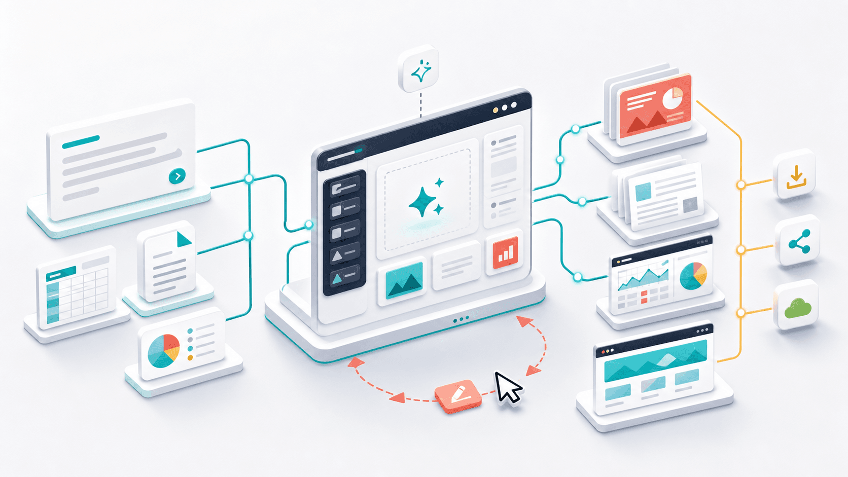
Discovery-to-dashboard flow: Discovery call -> Sample data -> Upload -> Auto-build -> Review -> Share -> Auto-update
3. Let AI Discover Hidden KPIs
Discovery calls capture known metrics like revenue, customer counts, and costs. The best insights often come from KPIs stakeholders are not tracking yet.
AI-powered analysis can surface:
- Correlation patterns between seemingly unrelated metrics (marketing spend timing versus sales cycle length)
- Anomaly detection highlighting outliers that warrant investigation (sudden cost spikes in specific regions)
- Segmentation opportunities revealing underperforming categories masked by aggregate totals
- Trend inflection points showing where growth rates accelerate or decelerate
These discovered KPIs become the base for your recommendations. You become the expert who sees what others miss, not just the person who visualizes known metrics.
4. Generate Multi-Page Dashboard Structures
Effective KPI dashboards serve different stakeholder levels. Executives need summaries. Operations teams need drill-downs. AI-generated dashboards create layered page structures:
- Executive Overview: Key scorecards showing performance versus targets with color-coded indicators
- Trend Analysis: Time-series charts revealing patterns over weeks, months, and quarters
- Comparative Performance: Regional, product, or team breakdowns identifying leaders and laggards
- Deep-Dive Diagnostics: Detailed tables and distribution charts for operational troubleshooting
- Narrative Insights: AI-generated plain-English summaries explaining what each visualization reveals
This multi-page structure lets every stakeholder find their view without extra complexity.
5. Enable Interactive Filtering and Exploration
Static PDF reports force clients to ask for custom cuts. Interactive client dashboards let stakeholders answer their own questions:
- Global filters allowing users to select specific time periods, regions, products, or other dimensions
- Drill-down capabilities enabling clicks on summary charts to reveal underlying detail
- Dynamic recalculation updating all visualizations instantly as filters change
- Synchronized views ensuring multi-page dashboards remain contextually aligned
This interactivity turns a one-time report into a living tool. It increases perceived value and reduces custom report requests.
6. Customize Branding and Layout
AI handles most setup, but professional dashboard design still needs brand consistency. Use post-generation customization to get client-ready polish:
- Drag-and-drop layout adjustments for visual hierarchy
- Custom color palettes matching client brand guidelines
- Logo and header insertion for professional presentation
- Chart type modifications when business context demands specific visualizations
- Text annotations highlighting key insights or recommended actions
This balance lets you deliver custom-quality dashboards at template speed.
7. Connect Live Data Sources for Auto-Updates
Dashboards add more value when they refresh automatically. Instead of manual monthly updates, connect dashboards to client data sources:
- Scheduled file imports from Dropbox, Google Drive, or SharePoint folders
- API integrations pulling data from CRMs, ERPs, or financial systems
- Version control tracking how metrics change over time while preserving historical views
Auto-updating KPI reporting positions your firm as a continuous partner, not a periodic vendor. It supports higher retention and expansion.
8. Share with Stakeholder-Specific Permissions
Not everyone needs access to every page. Use role-based viewing to maintain data governance:
- Executive links providing summary views with narrative insights
- Department-specific URLs filtering to relevant operational metrics
- Confidential sections requiring authentication for sensitive financial data
- Export permissions controlling who can download data versus view-only access
Clear permissions protect client data and make dashboards more useful across the organization.
Templates & Deliverables: Essential Dashboard Components
Use this baseline for most consulting engagements. Customize as needed by client and industry:
| Dashboard Type | Key Visualizations | Primary Audience | Update Frequency |
|---|---|---|---|
| Executive Summary | KPI scorecards, trend sparklines, variance indicators | C-suite, Board | Monthly |
| Financial Performance | P&L waterfall charts, budget variance, cash flow trends | CFO, Finance team | Weekly |
| Operational Metrics | Process efficiency charts, quality indicators, capacity utilization | Operations managers | Daily/Weekly |
| Sales Pipeline | Funnel conversion rates, rep performance, forecast accuracy | Sales leadership | Daily |
| Marketing ROI | Campaign performance, attribution analysis, lead quality scoring | Marketing team | Weekly |
| Customer Analytics | Retention cohorts, satisfaction trends, segment profitability | Customer success | Monthly |
Mandatory Components Checklist:
- ✅ Overview page with top 5-7 KPIs
- ✅ At least one time-series trend chart per major metric
- ✅ Comparative breakdown by region, product, team, or channel
- ✅ AI narrative summary of key patterns and anomalies
- ✅ Interactive filters for dimensional slicing
- ✅ Target versus actual performance indicators
- ✅ Export options for PDF and presentation formats
- ✅ Mobile-responsive design for on-the-go viewing
For strategic engagements, link dashboard insights to broader recommendations. Use AI Documents to generate strategic memos and connect data visualization consulting to action.
Measurement & Governance: Tracking Dashboard Value
Deploying KPI dashboards only matters if they improve decisions. Track these metrics to see if the dashboards work:
Adoption Metrics:
- Login frequency - How often stakeholders log in
- Session duration - Quick checks versus deep exploration
- Filter usage rate - Percent of sessions using filters or drill-downs
- Page navigation - Which sections get the most attention
Business Impact Indicators:
- Decision velocity - Time from data availability to decision
- Question reduction rate - Drop in ad-hoc data requests
- Forecast accuracy - Improvement from real-time visibility
- Stakeholder satisfaction - NPS or similar feedback on usefulness
Consulting Efficiency Gains:
- Hours saved - Time reduced from manual reporting
- Client retention - Compare living dashboards vs. static reports
- Expansion revenue - New work tied to dashboard success
- Consultant capacity - Analysts freed for strategy work
Quality Assurance Standards:
- Data freshness SLA - Max lag between source update and dashboard refresh
- Visualization accuracy audits - Quarterly checks for chart accuracy
- Narrative validation - Review AI summaries for context fit
- Mobile usability testing - Verify across devices and screen sizes
Monitor these metrics monthly. Share a short performance summary with clients to prove impact, not just deliverables.
Frequently Asked Questions
Q: As a consulting firm, how do we transition existing clients from static quarterly reports to living KPI dashboards without losing billable hours?
- Sell dashboard deployment as a value-add service
- Charge for setup, then move to an advisory retainer
- Focus the retainer on insight, actions, and strategy
- Emphasize continuous partnership over periodic reporting
Q: What happens when a client's data structure changes mid-engagement—do we need to rebuild the entire dashboard?
- No. AI platforms like ML Clever handle schema changes
- New columns trigger re-profiling and suggested updates
- You review and approve changes instead of rebuilding
Q: How do we handle clients who insist on very specific chart types that don't match AI recommendations?
- All dashboards are fully customizable via drag-and-drop
- Swap chart types while keeping data connections intact
- AI gives smart defaults, but you keep final control
Q: Can we white-label these dashboards so they appear as our firm's proprietary IP rather than a third-party tool?
- Yes. Most dashboard design platforms support white-labeling
- Add your logo, colors, and custom domain links
- Clients see your deliverable, not a third-party tool
Q: What if a client wants to export the dashboard for offline presentations or board meetings?
- Export dashboards to PDF and PowerPoint
- Use executive summary pages for board decks
- Keep deep dives as live links for detail
- Combine snapshots with Presentations for narrative slides
Q: How do we price dashboard creation versus ongoing access—is this a one-time project or recurring service?
- Typical model is setup fee + monthly access
- Example: $5-8K setup, then $500-1,500/month
- Recurring pricing aligns incentives and supports continuous value
Take the Next Step: From Discovery to Deliverable in Days, Not Weeks
The consulting firms winning in 2025 are not the ones with the fanciest visuals. They deliver insight at the speed clients expect. KPI dashboards that update automatically and reveal hidden patterns help you move from report factory to strategic partner.
What clients want most:
- Faster answers without new report requests
- Clear trends and anomalies, not just charts
- A dashboard they can explore on their own
Stop billing hours for manual chart updates. Position your firm as the intelligence layer that turns client data into advantage. Every discovery call contains dashboard potential. The question is whether you build it in weeks or generate it in hours.
Ready to transform your consulting deliverables? Create a Dashboard from your next discovery call. Show the difference between traditional BI complexity and AI-powered insight. Your clients want faster answers. Deliver both.
Manage client dashboards, strategic memos, and deliverables with AI Documents and AI Dashboards so consulting teams stay aligned throughout every engagement.

ML Clever Team
Industry Experts