AI executive dashboards built around the signal.
Bring KPIs, trends, risks, and written takeaways into one decision-ready view that helps leadership understand what changed and what needs attention.
Prompt Ideas
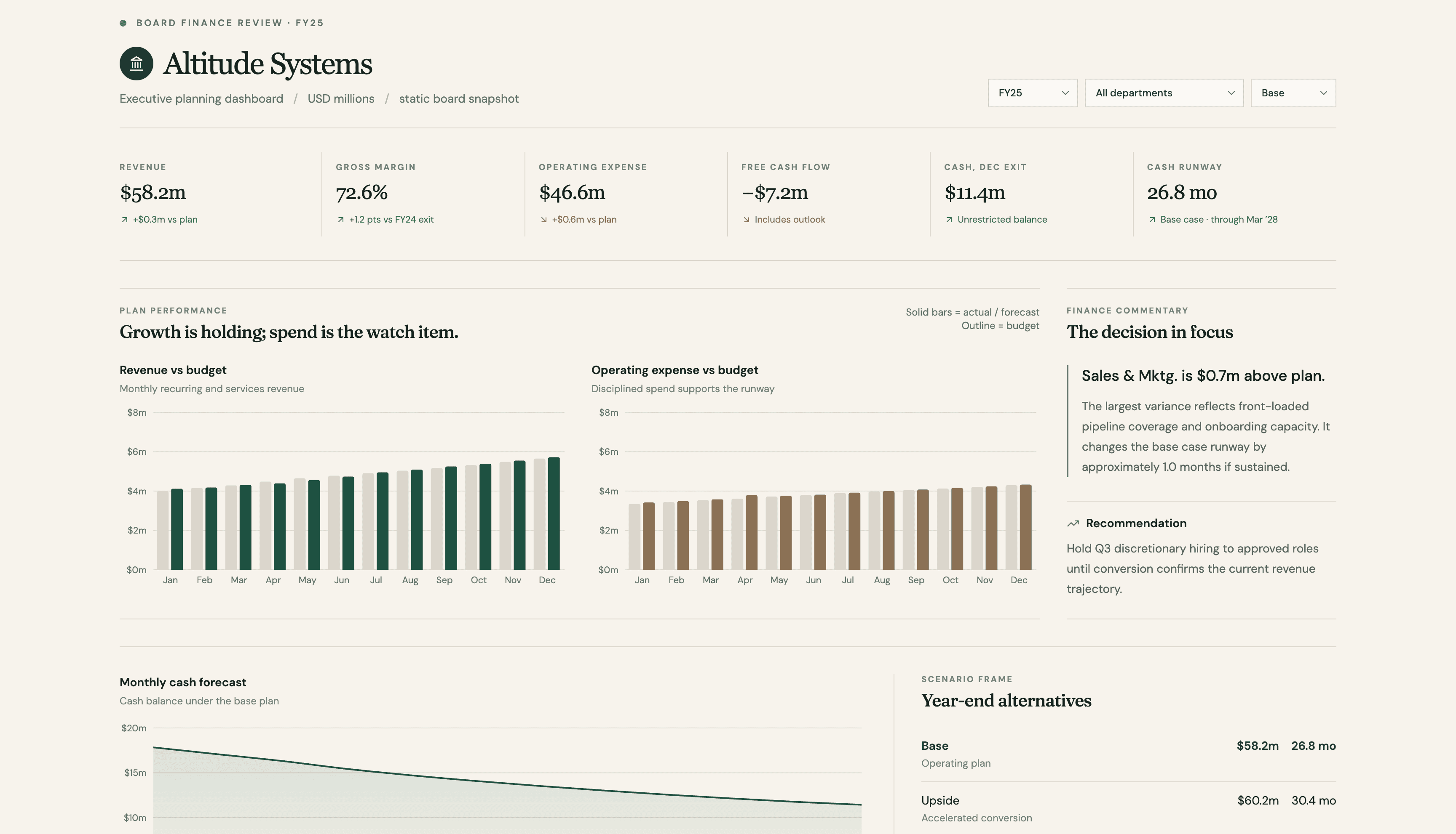
Bring KPIs, trends, risks, and written takeaways into one decision-ready view that helps leadership understand what changed and what needs attention.
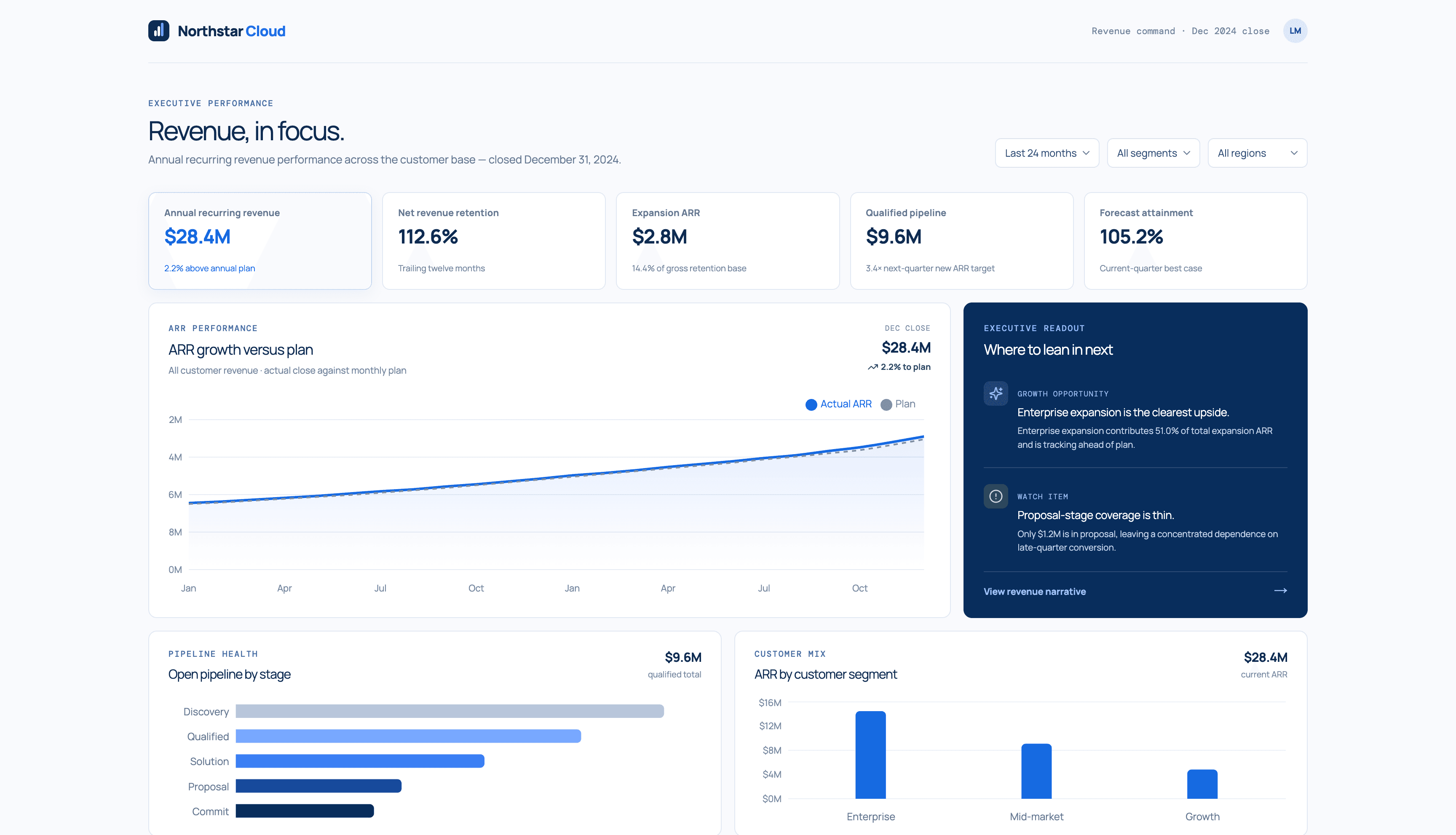
Track revenue and pipeline performance against plan, compare segments, and pair every chart with the context sales and finance need for the next decision.
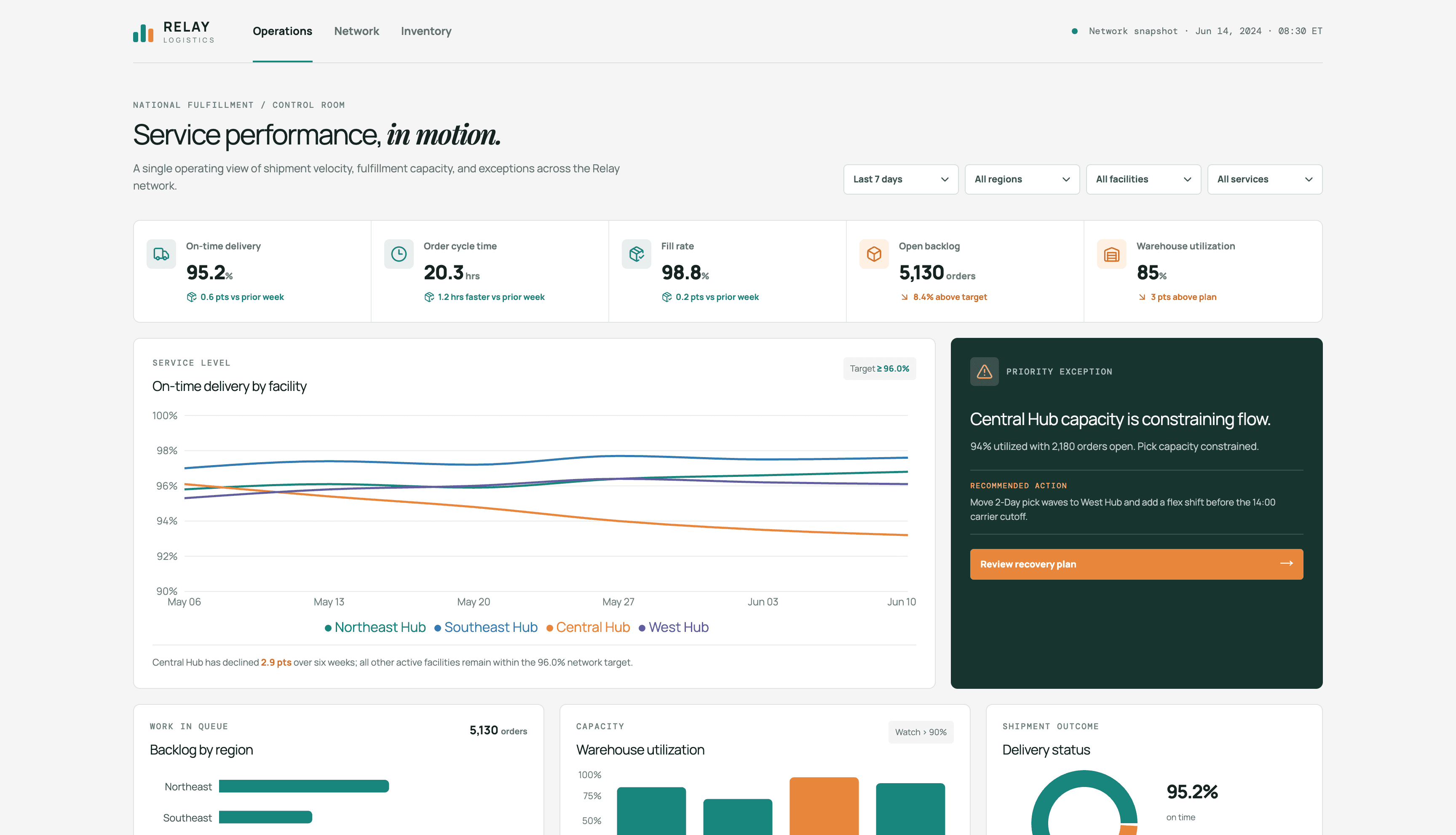
Monitor movement across teams, products, or workflows and ask follow-up questions in plain English when a metric looks wrong.
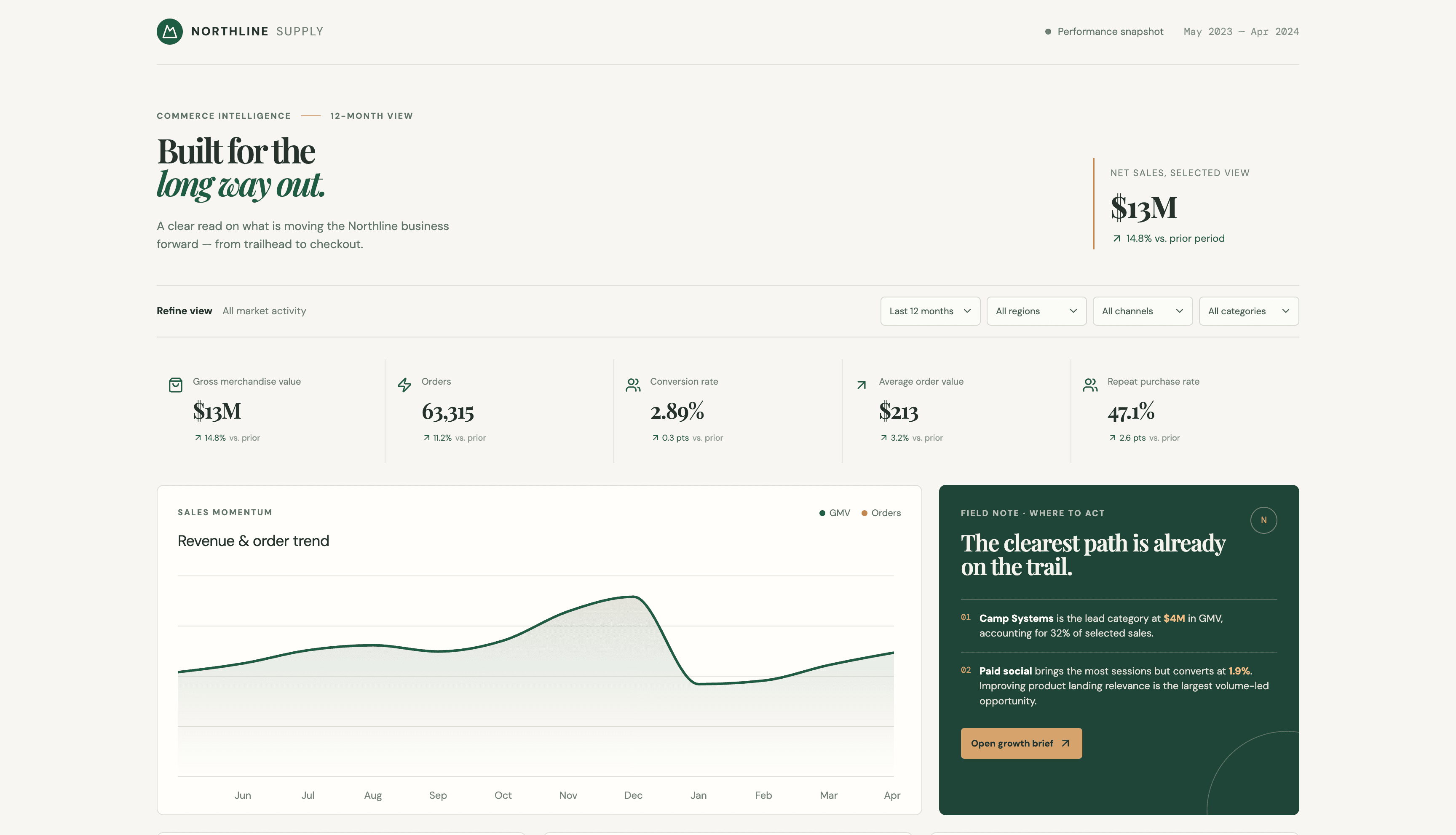
Move from the headline metric to the explanation behind it with plain-English questions and contextual analysis.
Build executive, sales, marketing, finance, product, and operations dashboards from a spreadsheet or connected source—without starting from a blank canvas.
Summarize the KPIs, trends, and risks leadership needs in a focused view designed for fast, informed review.
Track quota, pipeline coverage, conversion, velocity, and deal health across teams, stages, and segments.
Connect campaign spend, channel performance, funnel conversion, and acquisition efficiency in one interactive view.
Compare actuals with plan, monitor margins and cash, and add written analysis explaining the variance behind the headline numbers.
Explore adoption, engagement, retention, and behavior to understand where users find value and where they leave.
Track throughput, quality, service levels, and exceptions so teams can spot operational issues earlier.
An AI dashboard generator turns a spreadsheet or connected data source into an interactive analytics view. ML Clever organizes the relevant metrics into KPI cards, charts, filters, and written insights so you can move from raw data to a useful dashboard without building every element manually.
Upload the spreadsheet, describe the audience and the questions the dashboard should answer, and identify any metrics or comparisons that matter. ML Clever analyzes the data and generates a structured dashboard you can refine through follow-up instructions.
No. Upload a spreadsheet or connect a supported data source, then describe the metrics, comparisons, and questions you want to explore in plain English. ML Clever handles the initial analysis, chart selection, and dashboard structure.
Yes. Ask for another breakdown, compare periods, investigate an anomaly, change a grouping, or request a different visualization after the first dashboard is built.
ML Clever considers your question and the shape of the data to select useful visualizations. You can still change the chart type and layout afterward.
Dashboards built from a connected source can refresh as the source data changes. For an uploaded spreadsheet, replace the source file or connect an ongoing data source when recurring updates are needed.
Yes. Prepare a focused dashboard view for internal review or client sharing while keeping the charts, written analysis, and supporting context together.